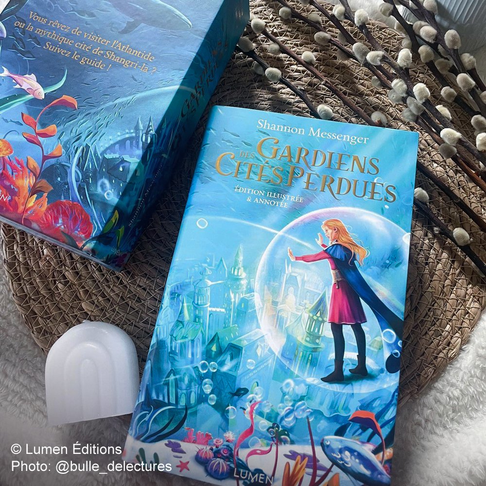
Keeper of the Lost Cities
Last year, I had the pleasure of illustrating the cover of the collector's edition of one of my absolute favourite book series, Keeper of the Lost Cities by Shannon Messenger, published by Lumen!
I had a lot of fun designing the city of Atlantis, featured both on the dust jacket and the pretty box set containing the book and some pretty cool gifts!
After studying the client’s brief, a request to illustrate a scene in which the characters visit Atlantis via a giant bubble, I came up with an insane number of sketches in three different batches. Usually, 3 or 4 suffice to give a client some solid options to choose from, but I made an exception for this project because I love the book series, I wanted to explore different perspectives and compositions, and I had to work on some changes per the client’s feedback – after each round of revisions. This resulted in many sketches.
The publisher chose a variation of the third and fourth sketch, and I like the final result, but my favourite was the first one because stylised architectural design is my comfort zone.
In every sketch I do, I need to fall in love with something so that, no matter which option a client picks, I won’t feel too disappointed if it's not my favourite!

WIP… or what I consider my final illustration.
On this book cover, the landscape is important. We’re looking at Atlantis, so, while I normally paint the background first, this time I treated it as the protagonist.
Unfortunately, the foreground never seemed to be right to the publisher. They wanted the sand to be more white and to have more different plants (I’d have kept them at a minimum like in the WIP, which I like because of how dynamic the algae are, and I also liked the underwater effect on the sand), so the final cover looks pretty different compared to the one I delivered.
I’m not going to lie, I didn’t really agree with the direction the final cover took because it looks too busy (and they simplified it again in the end by replacing the foreground completely, so I guess I was right, even though I didn’t manage to find a solution myself). Sophie also looks a little too saturated and dark in my opinion, both in my version and in the publisher’s.
I can’t complain too much though because the book is stunning and I had a lot of fun painting the city of Atlantis.

Final